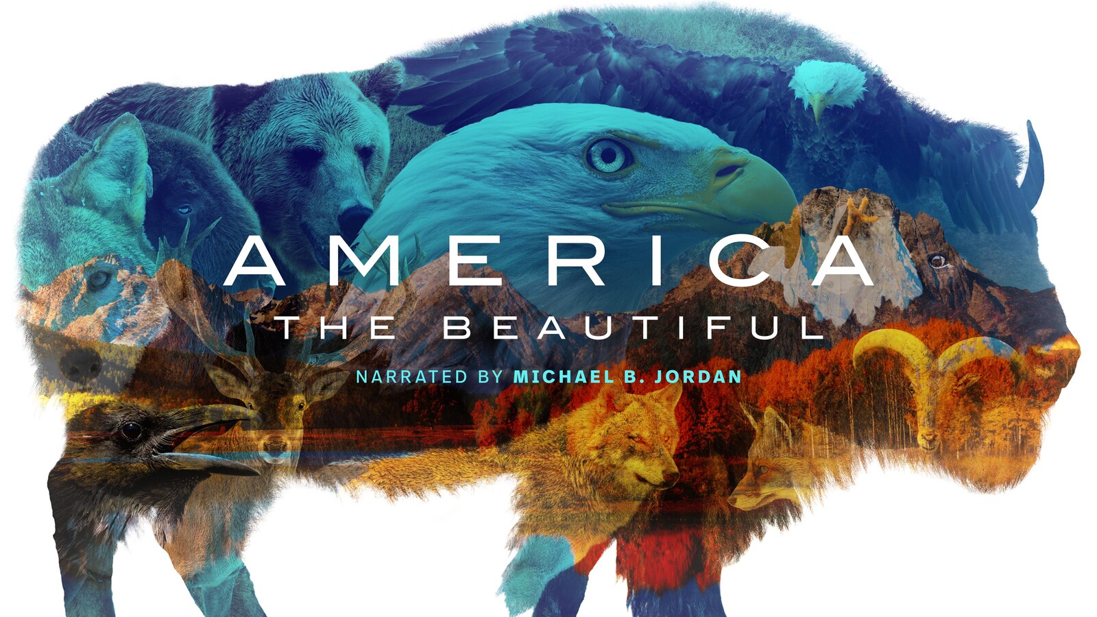
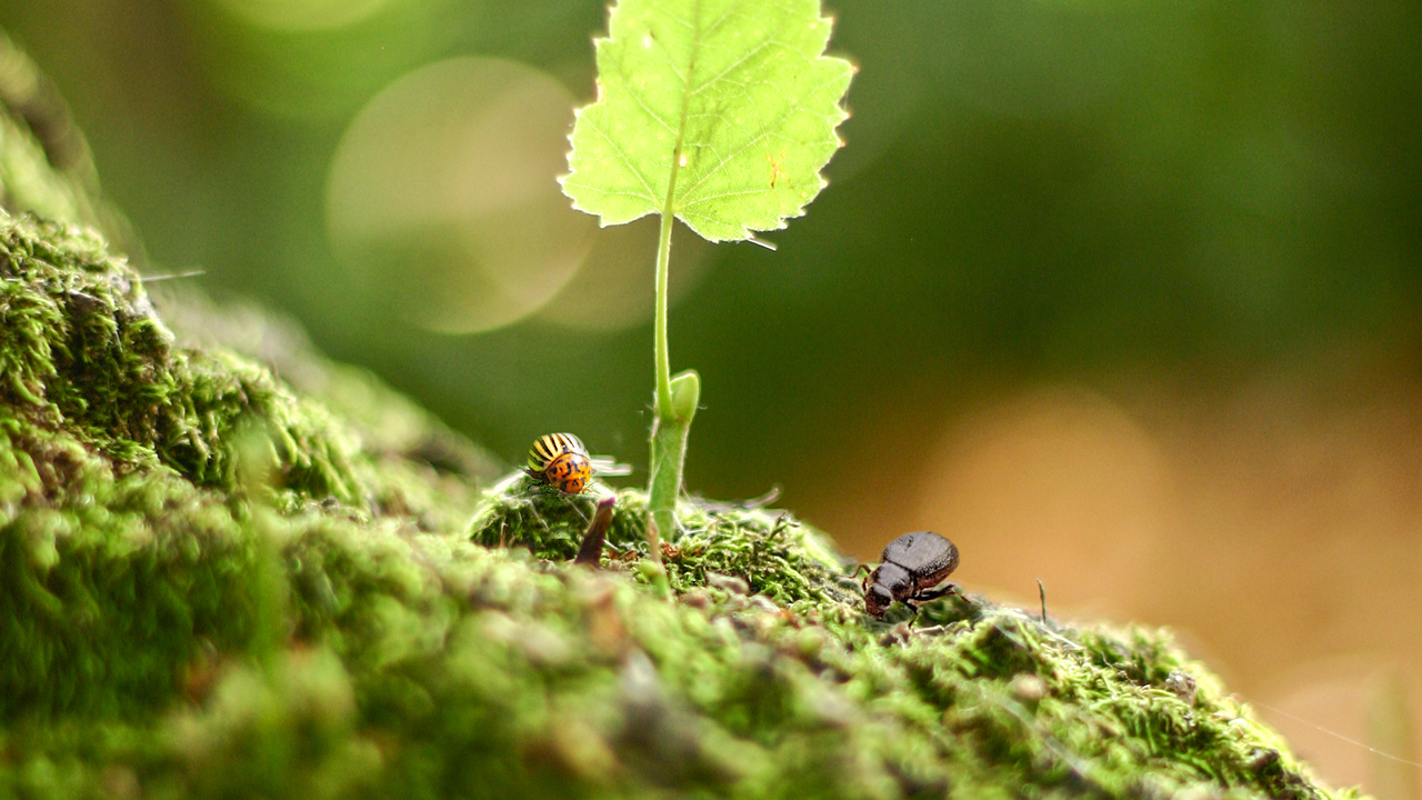
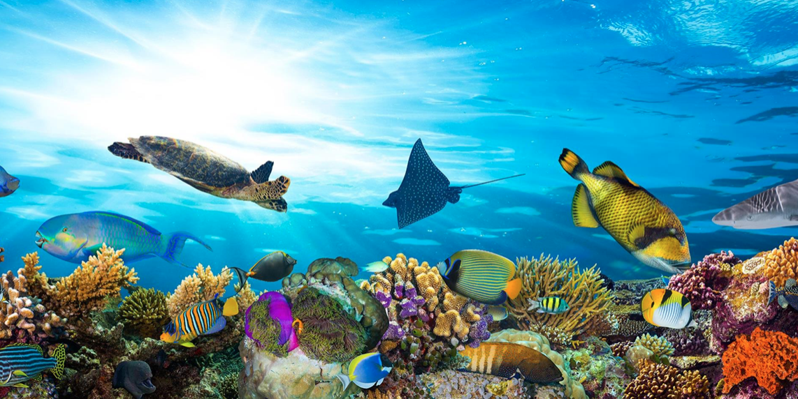
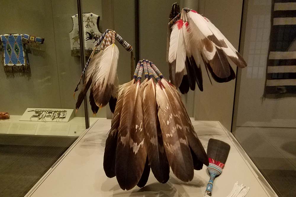
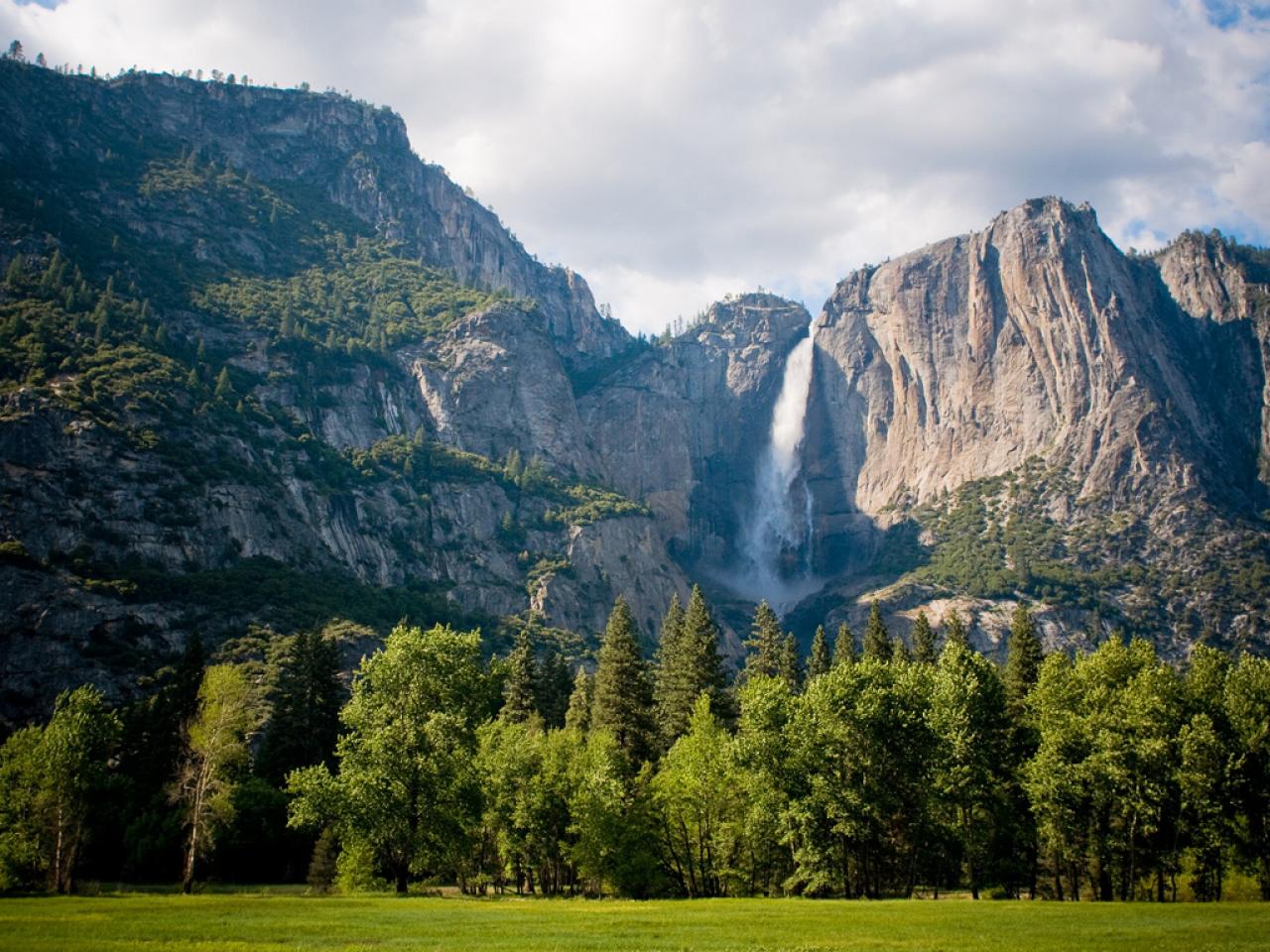
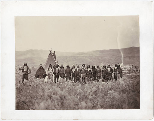
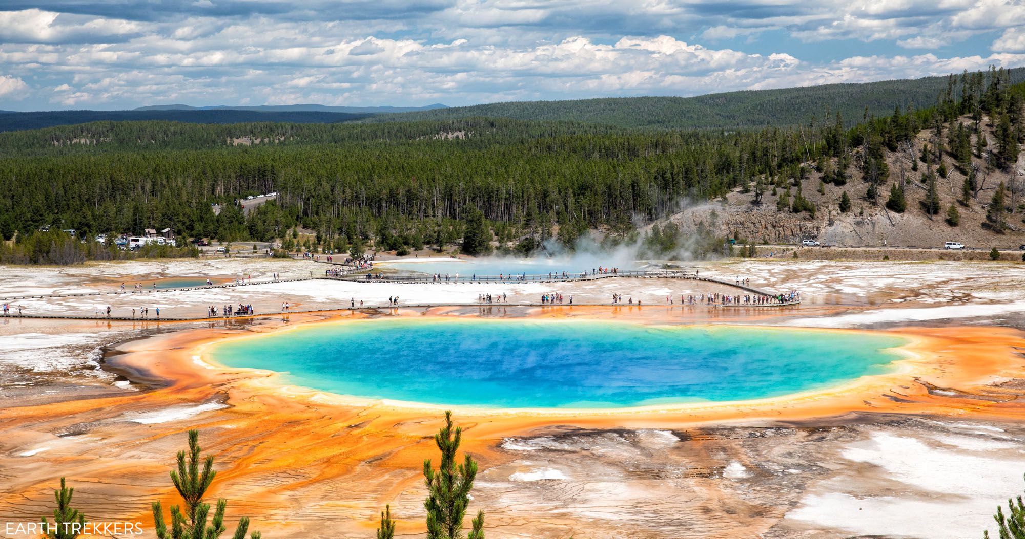
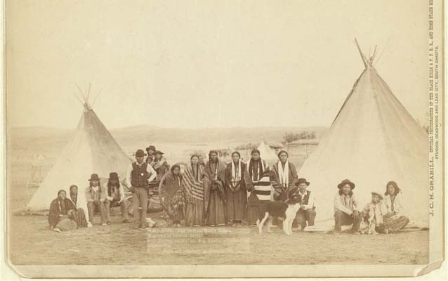
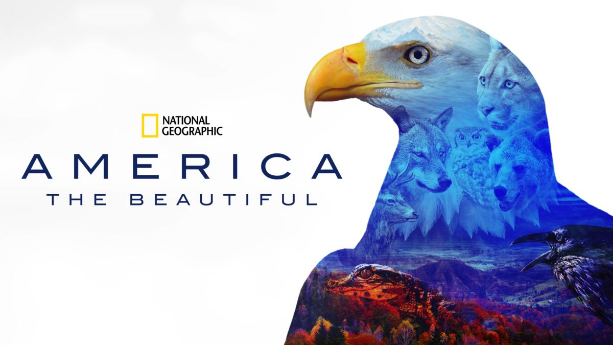
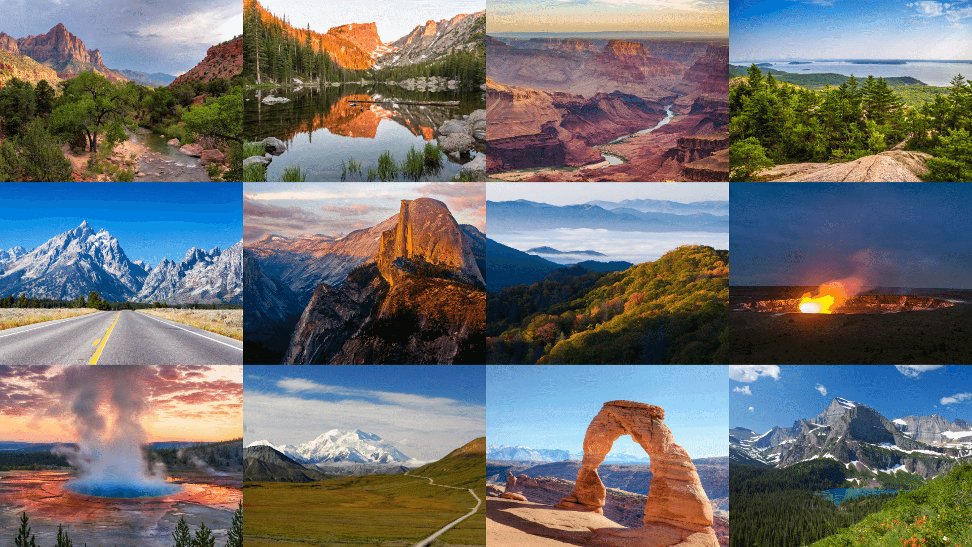
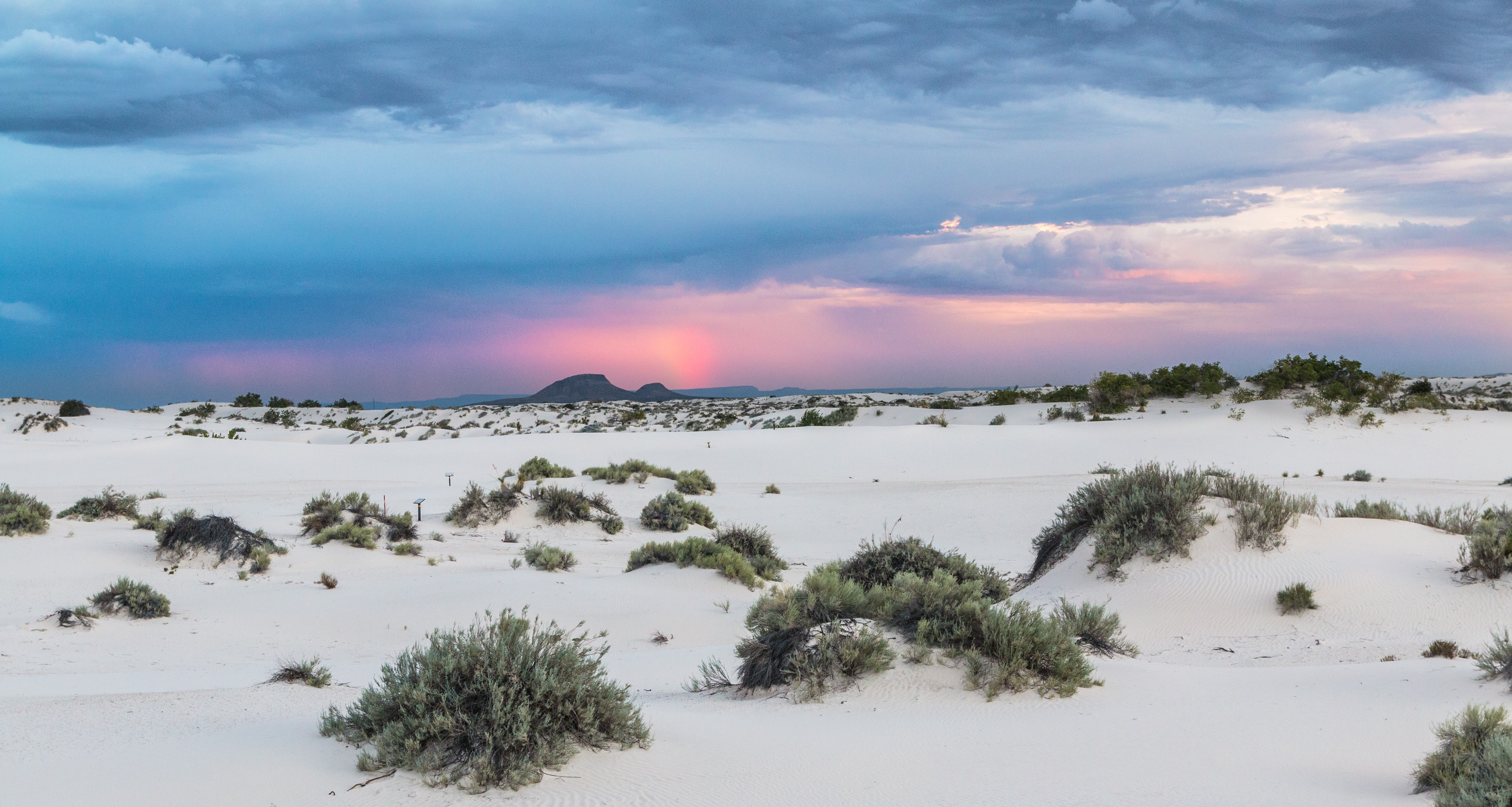
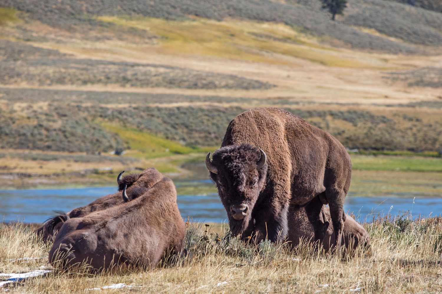
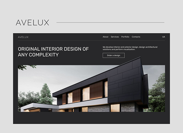
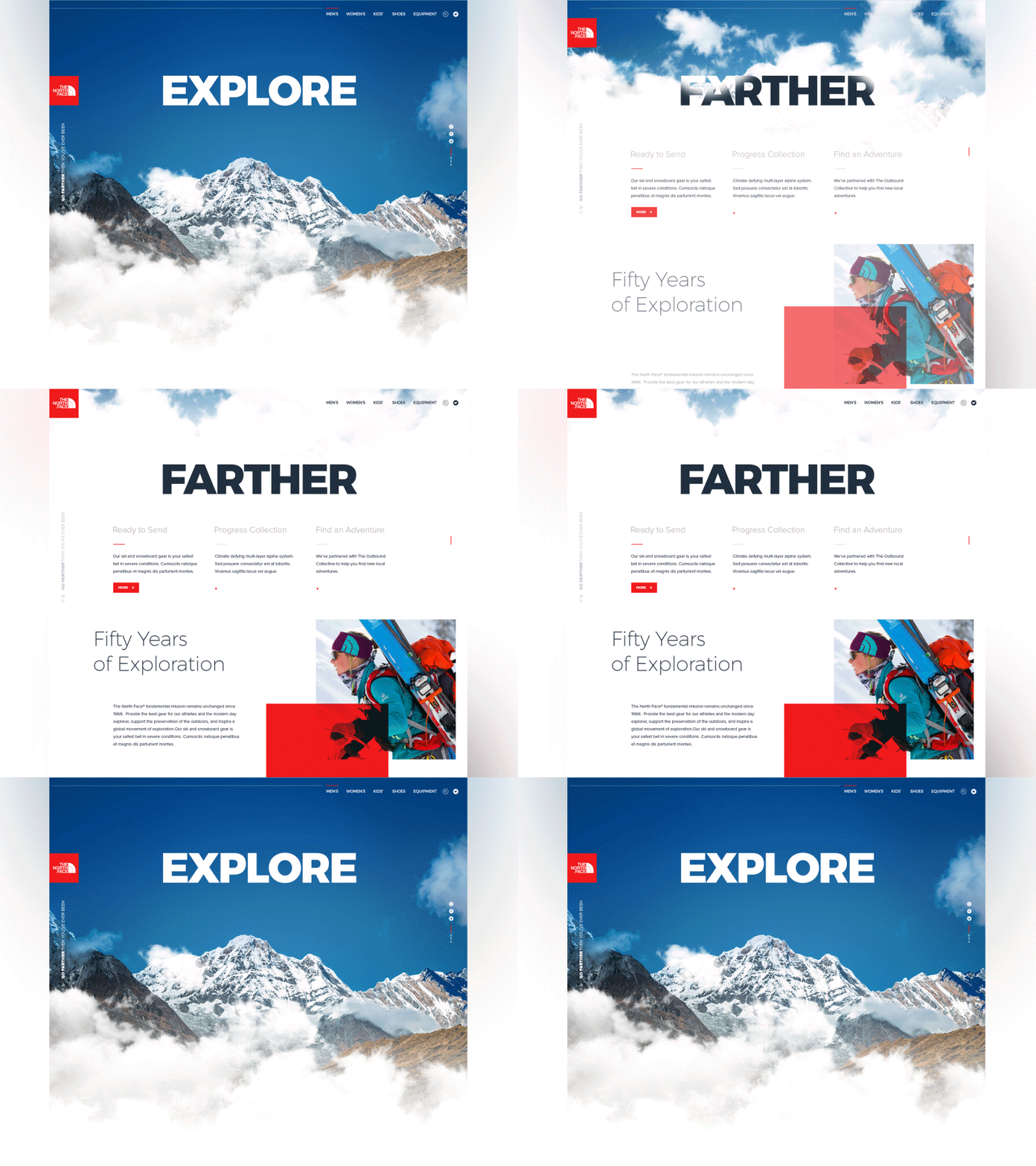
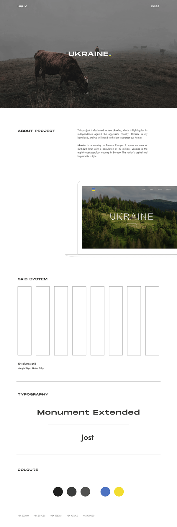
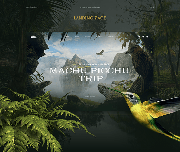
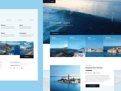
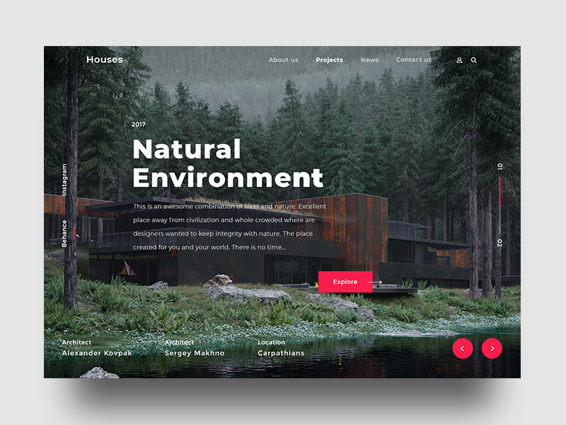
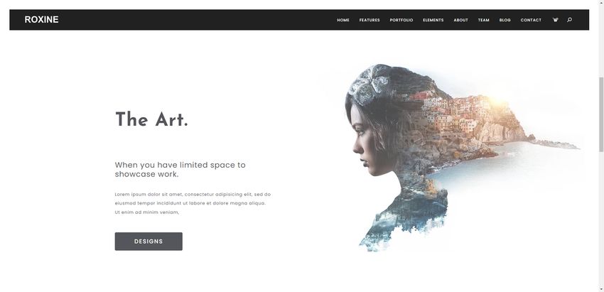
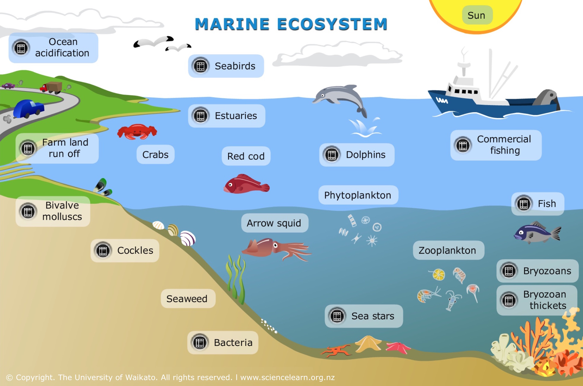
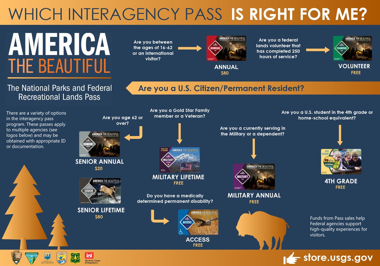
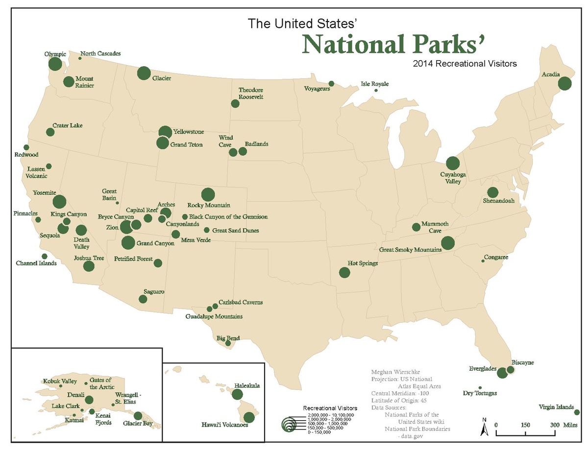
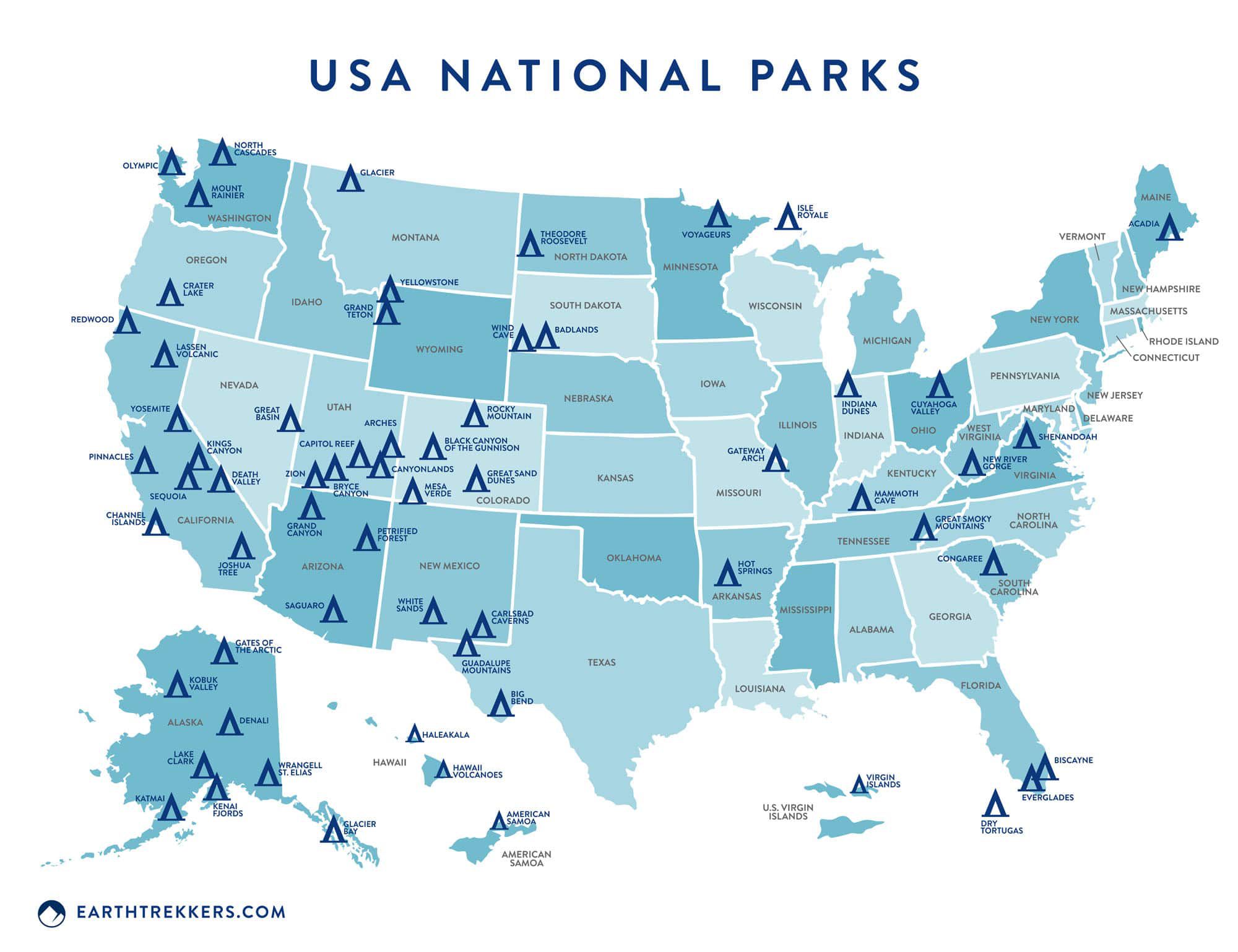
Some of the Department of the Interior (DOI)'s goals are to protect our national parks and natural history, deal with the country's infrastructure, and protect Native American Tribes. The following images remind me of those goals.
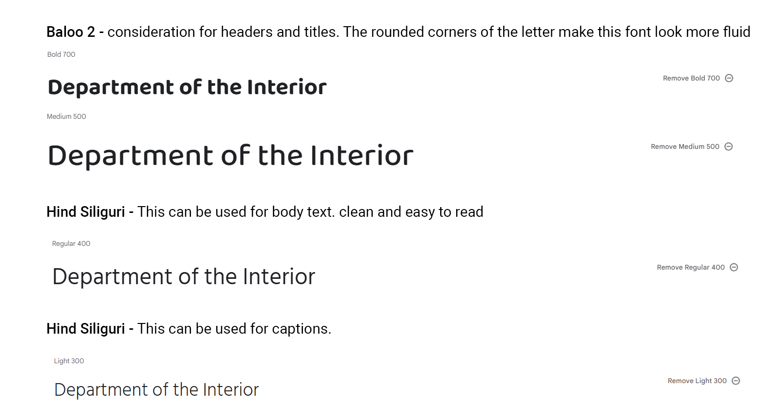
Typography
These are the fonts that offer inspiration for the Department of the Interior as it relates to nature and the natural world around us. They have a natural look and feel, as the roundness breaks with the straight line at the right places — just as in the natural world, nothing follows a straight line. The curvature in the Baloo font decreases the sharpness of the corners in the letters.
Color Palette
Colors extracted from selected images, earthy natural tones that provide good contrast and relate to the natural and cultural heritage of the Department of the Interior.
Blue
#023373
Cream
#F2F0D5
Orange
#F29F05
Green
#318C23
Light Blue
#63D8F2
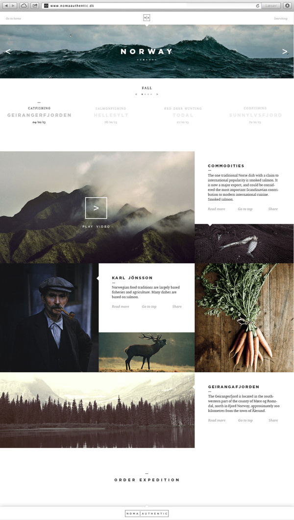
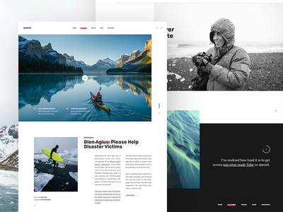
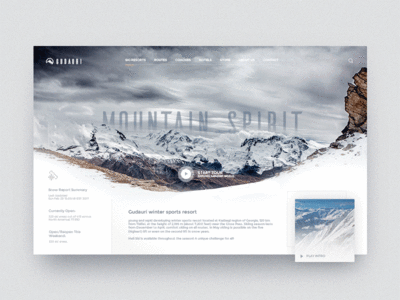
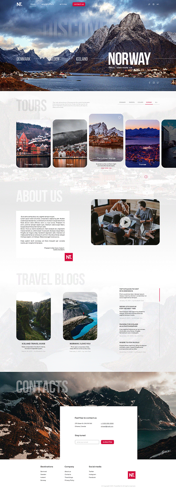
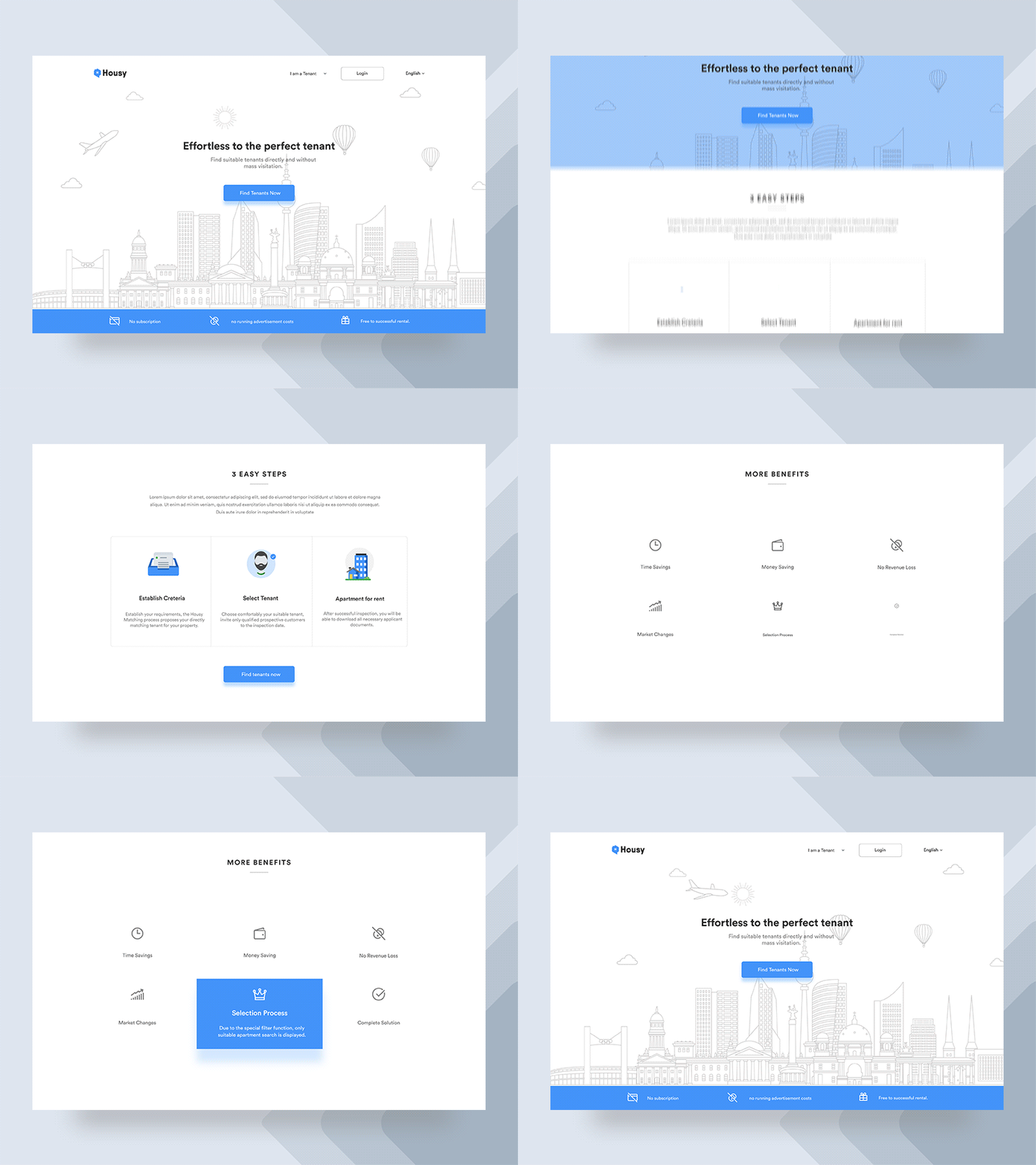
UI Inspiration
These are UI examples and inspiration I found while researching, so I have a good visual reference of the aesthetic tone and style the DOI can capture as it pertains to the appearance of their web site.
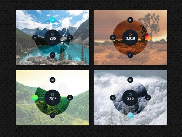
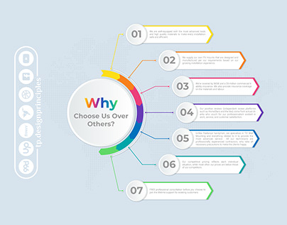
Inspirational Infographics
These are examples of infographics I found which relate in subject matter to the type of data-driven visuals the DOI website could feature.