travelPal
Description: TravelPal is a mobile app that provides travelers an organized way of planning activities and maximizing their time experiencing all aspects of a destination based on their interests, on a budget, while having fun.
Problem Hypothesis: Travelers who struggle to balance time and budget while planning activities need a single place to organize their trip, discover places that fit their interests, and stay on budget — without losing time bouncing between separate apps.
Project Team: Pavlos Savva (UX Designer & visual & front end) — solo project
Tools used: Figma, Miro, InVision, Photoshop, Illustrator, G-Suite
This was my first project completed in my UX bootcamp — the earliest step in the process that led to Trail Buddy and Museum 8.

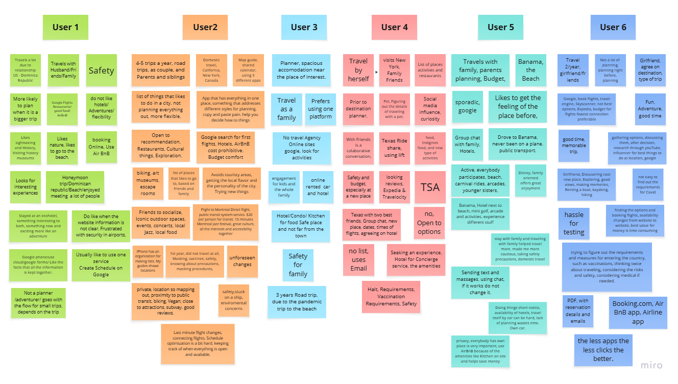
Through user interviews and an online survey, the research surfaced that time, budget, and easy access to useful information during trip planning matter most to “go with the flow” travelers.
These insights pointed toward a single platform that unifies activity planning — giving timely, on-budget access to places of interest and transportation, so travelers spend less time planning and more time experiencing their trip.
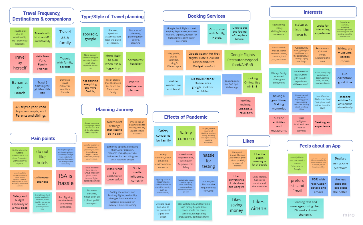
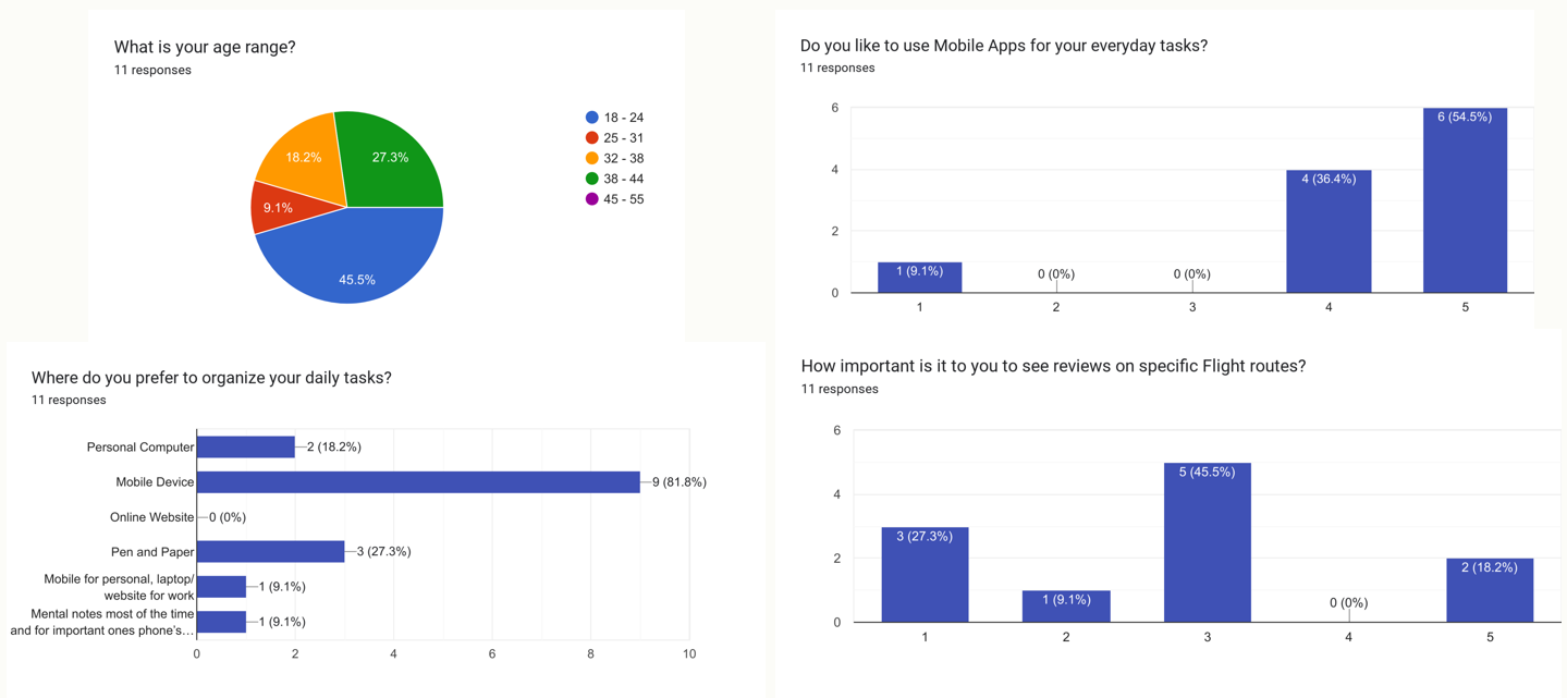
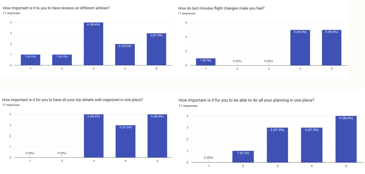
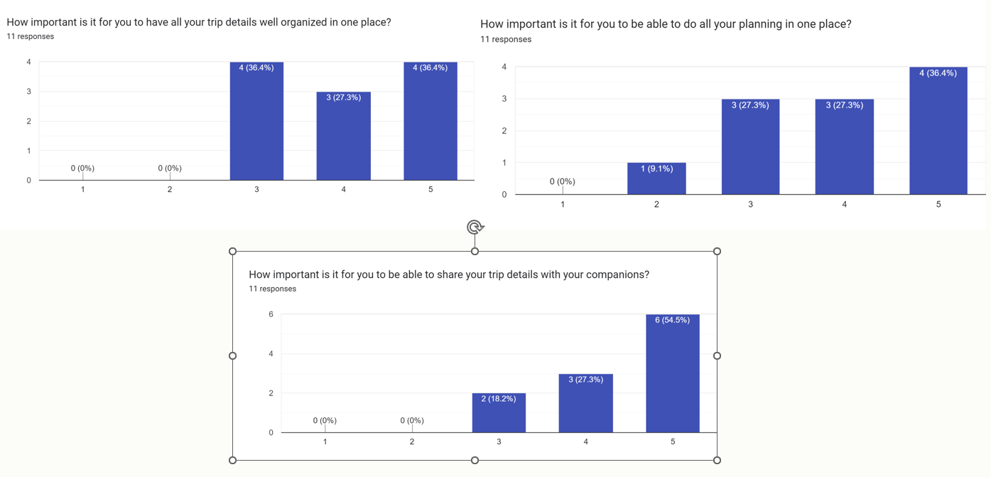
This survey showed us that our user prefer to have all their plans in one place and care to have easy access to information that relates to their travel during traveling.
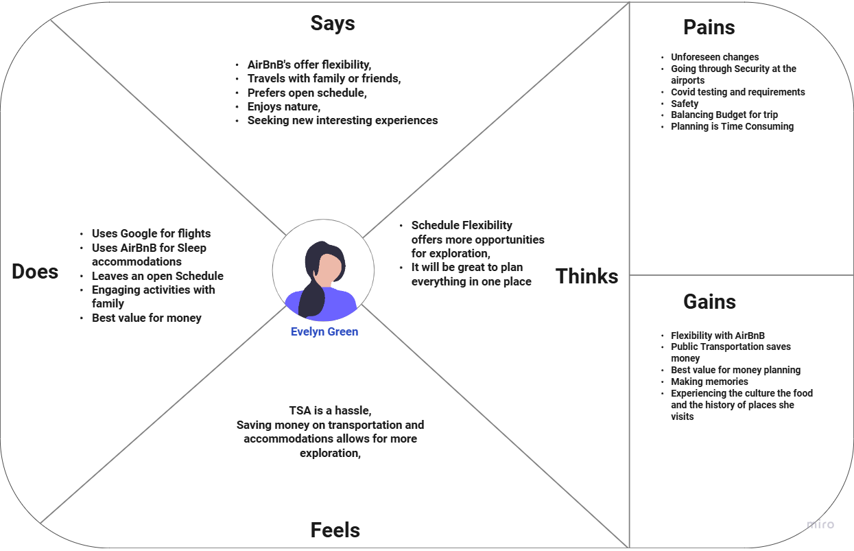
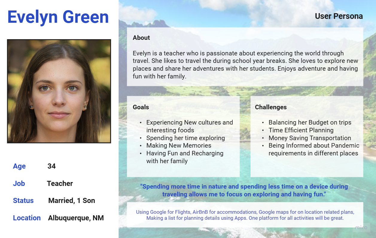
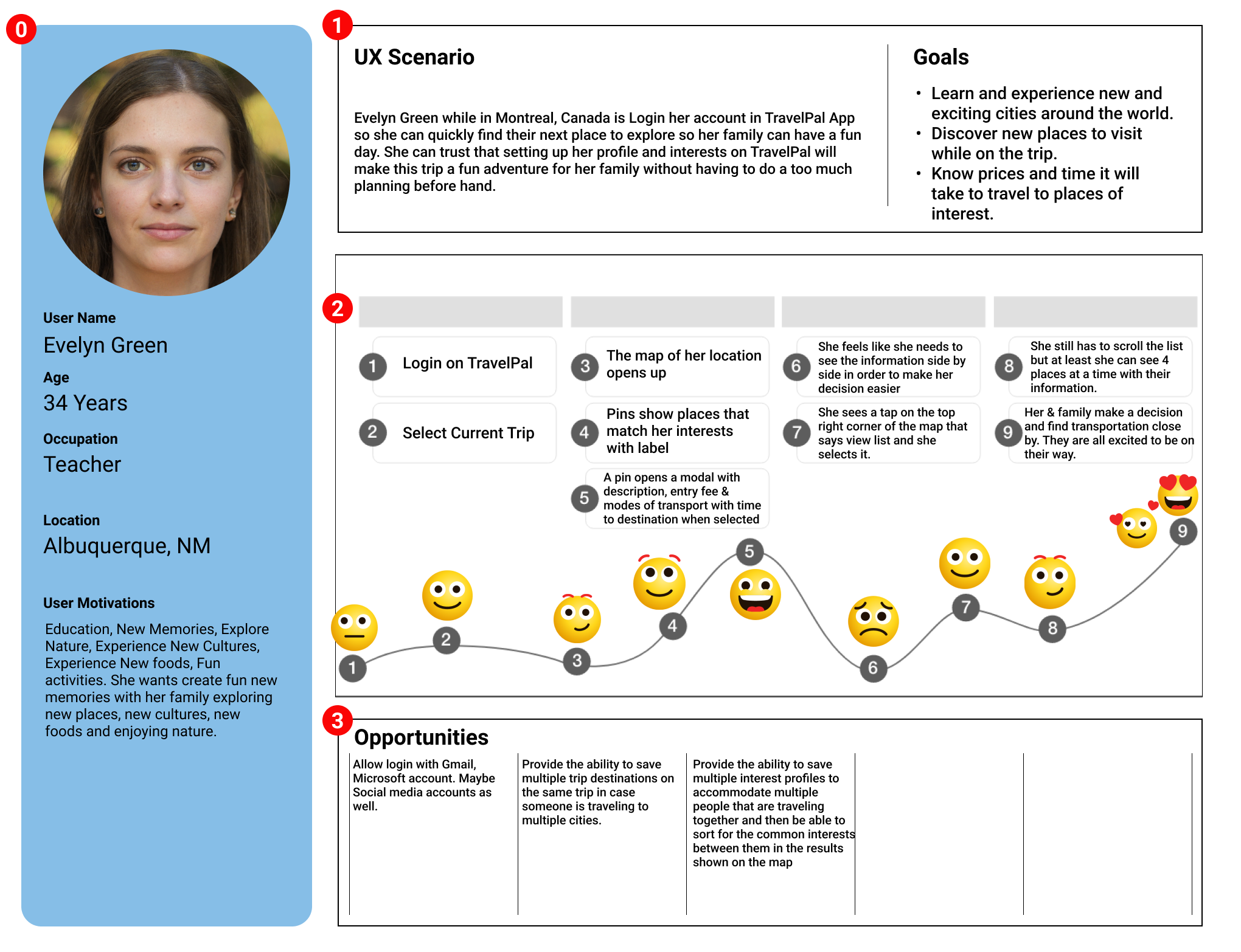
User Insight Statement: Evelyn Green needs an organized way of planning her travel with family on a budget, to maximize their time experiencing all aspects of the destination that interest them while having fun.
Problem Statement: Evelyn Green, a teacher and a mother, struggles to plan and organize activities that fit her busy schedule and budget, while ensuring that she and her son can fully experience and explore all aspects of the destination that interest them while having fun.
Value Proposition: TravelPal is a mobile app that helps busy travelers and their families who struggle with on-location planning to maximize having fun, balancing their time and budget while experiencing all aspects of their destination quickly and easily.
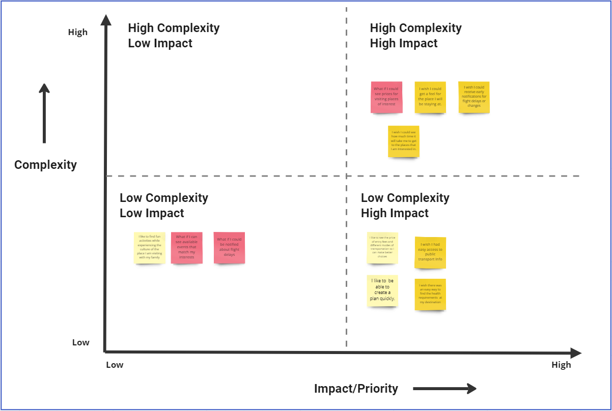
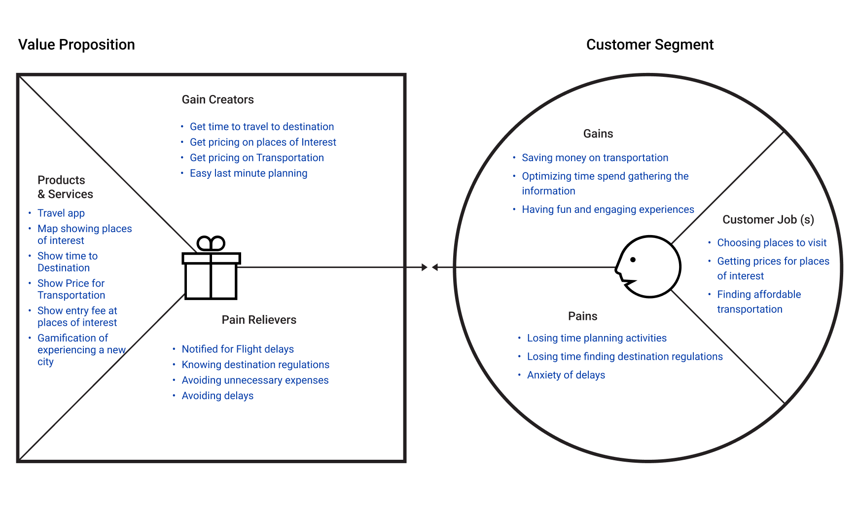
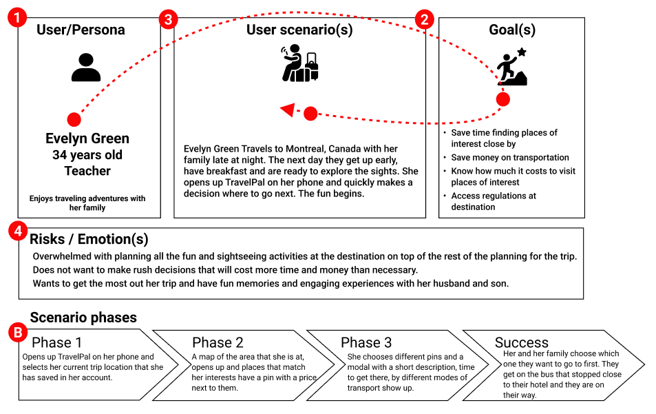
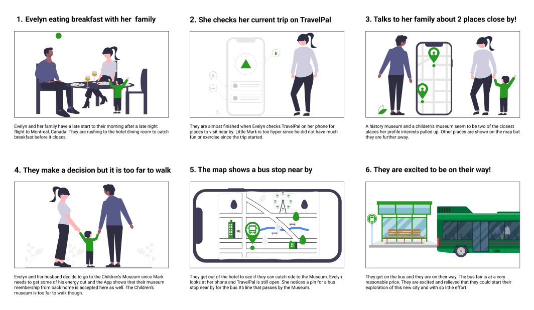
Brainstorming and ideation moved through a feature prioritization matrix and a value proposition canvas, followed by a user scenario, storyboard, and user journey map to trace how Evelyn would move through planning and taking her trip.
The opportunities focused on unifying activity discovery, budget-aware recommendations, and transportation information in one place, so travelers spend less time switching between apps.
Initial features included booking flights and accommodation in addition to the planning of on-location activities and generating a shareable list of all the plans. An all in one App. User feedback and the tremendous effort required by the software team to accomplish features that already exist in other apps let me to focus on designing the on-location activities planning that users are more interested in. This provides users that are not big planners with a way to balance their time and money at their destination.
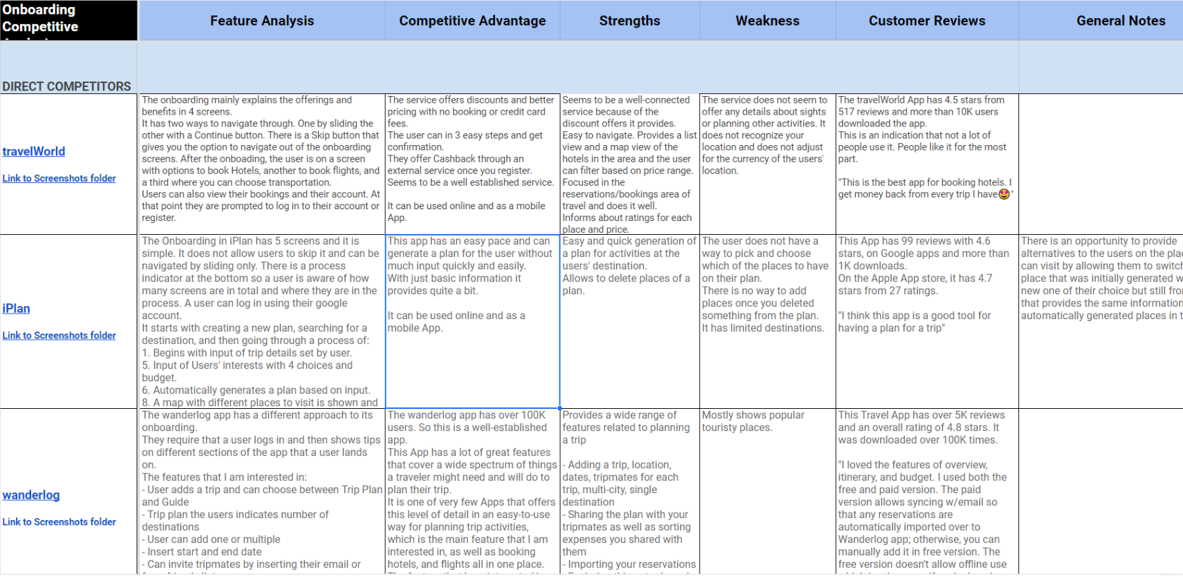
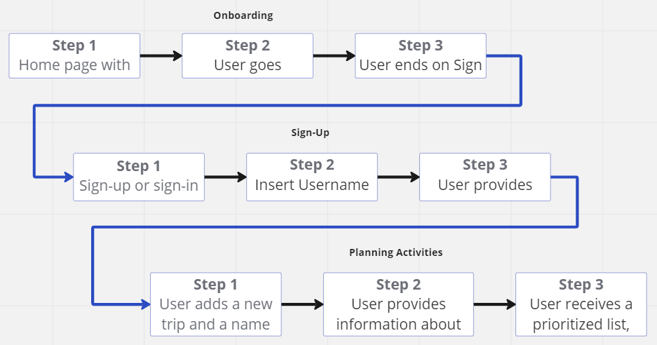
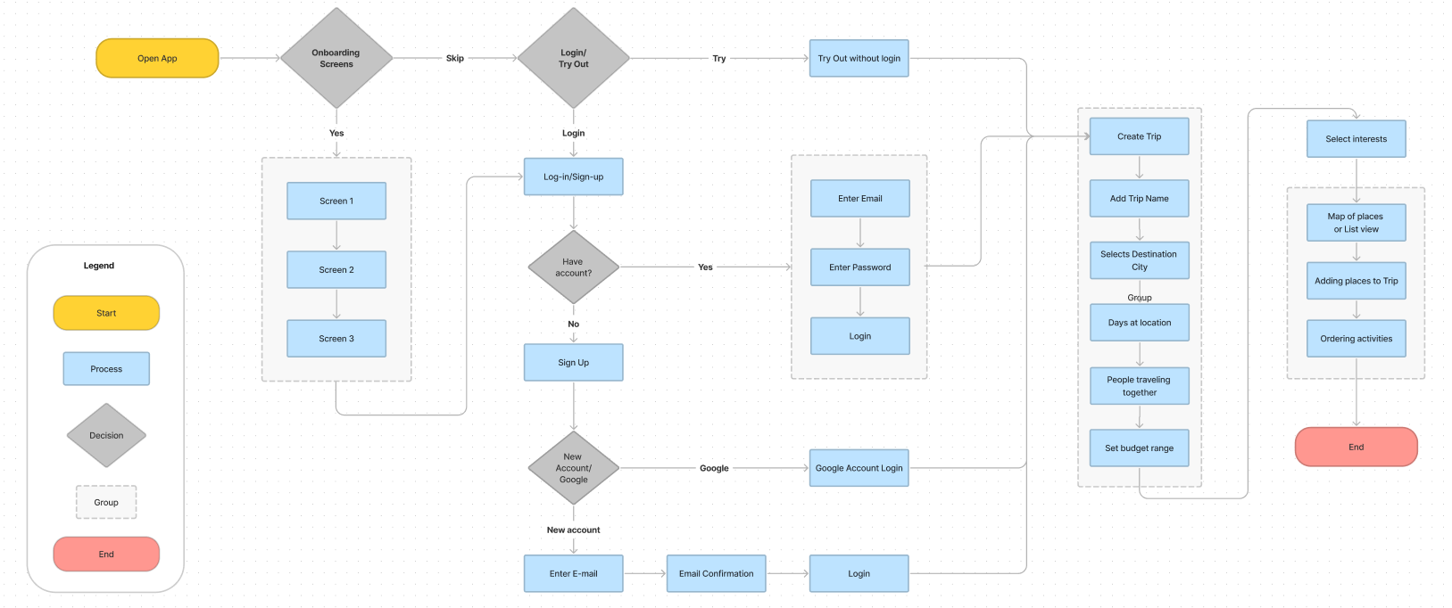
I started the process of designing the user interface by doing a Competitor Analysis on existing travel apps. Next I created a User Flow that follows my research so far and then created the User Flowchard.
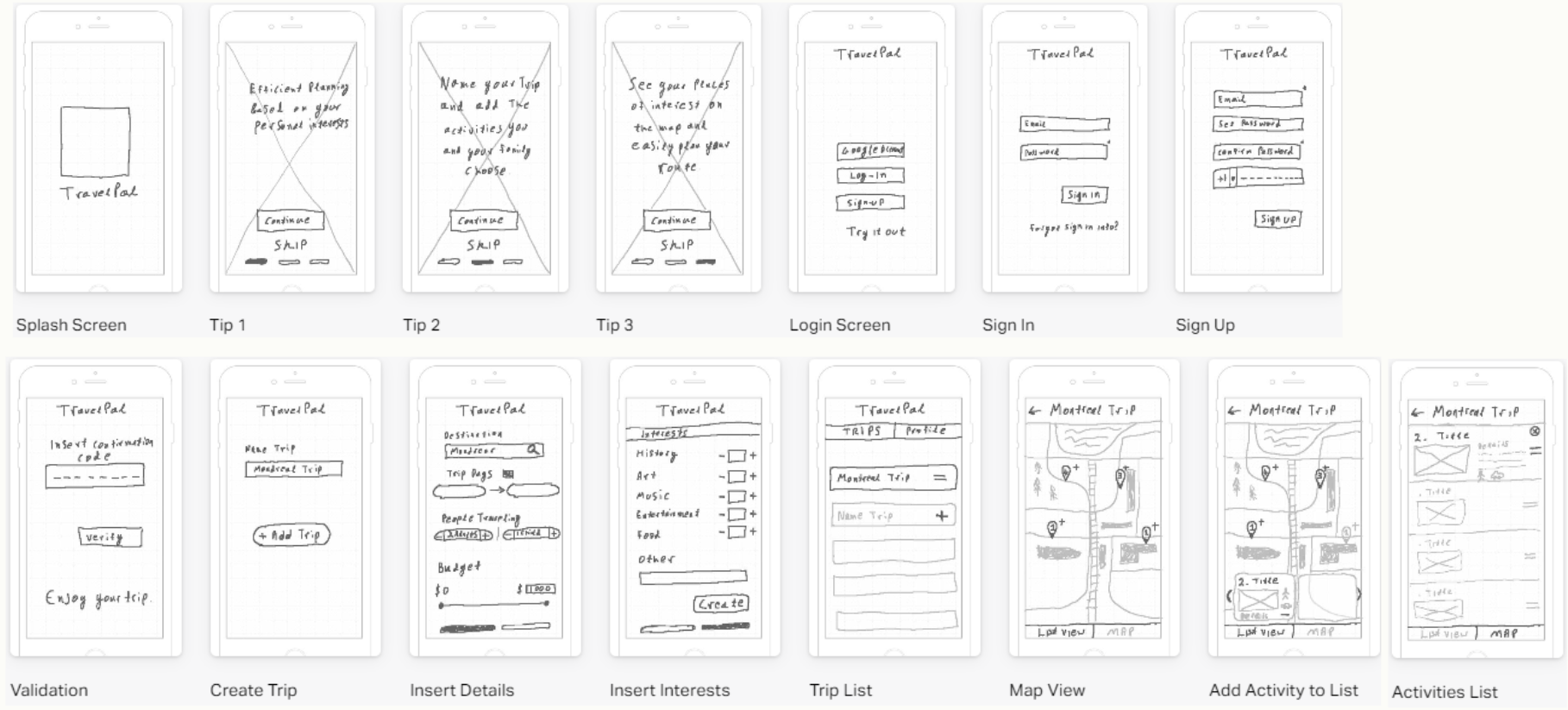
Sketched wireframes came together first to establish onboarding, trip creation, and the map/list view for adding places — the core flows the research pointed to as highest priority.
These were tested with users via an InVision clickable prototype before moving into digital wireframes in Figma.
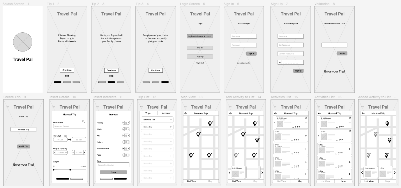
The digital wireframes were built in Figma to prepare for usability testing on the core flows: onboarding, sign in/sign up, creating a trip, and adding places to a destination list.
We performed Guerrilla usability testing with 5 users, ages 20–40, full-time working travelers.
Task 1: Onboarding.
One user found the multiple navigation paths through onboarding confusing; the rest moved through all three screens without skipping.
Sign up / Sign in:
One user wanted sign-up and sign-in reordered by priority, and found the “Try it out” option unclear in what it would do.
Task 2: Creating a new trip.
Interaction was mostly straightforward, but one user didn't realize they needed to click a created trip to select it, and the “add trip” button wasn't obviously actionable.
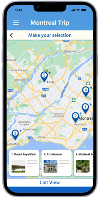
Task 3: Viewing and adding places from the map and list view.
The most discovery-heavy flow — not all users recognized the add icon on map pins, and expectations for the list view weren't clear.
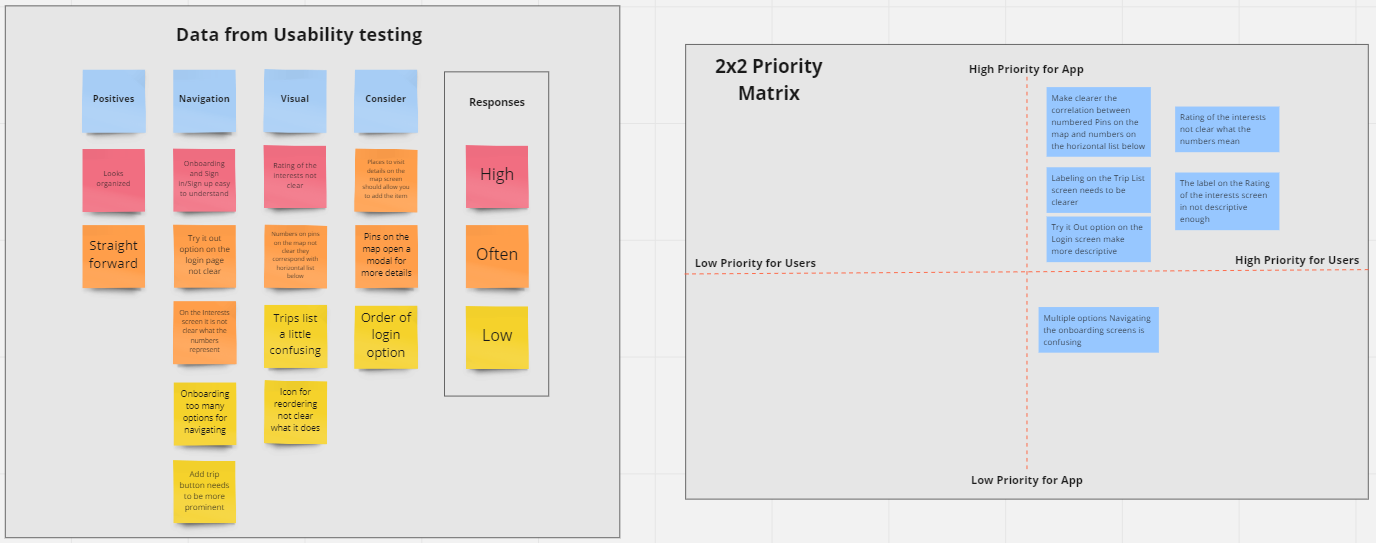
TravelPal validated a real need — travelers with limited time and budget want their planning, discovery, and on-location decisions unified in one place rather than spread across separate apps and browser tabs. Usability testing surfaced clear, fixable friction points around discoverability of the add/view actions on the map, which directly shaped the hi-fi iteration.