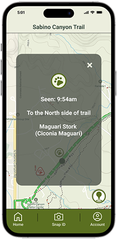
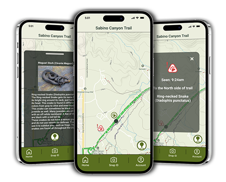
Description: Trail Buddy is a brain child of mine, for an app that allows Hikers to notify others about dangerous or interesting plants and animals on the trail.
Problem Hypothesis: An app that helps hikers identify plants and animals on the trail using AI as well as to allow them to report live these sightings or warn others of potential dangers will be very useful.
Project Team: Pavlos Savva (Concept originator, UX Designer, visual & front end lead), Ethan Richard, Juliette Hartel, JaQue Latham
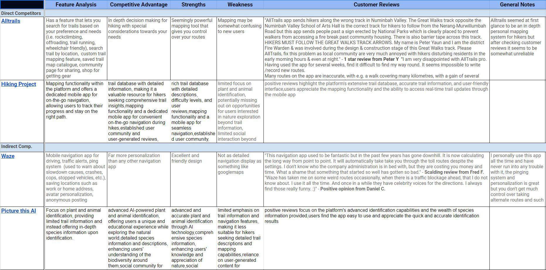
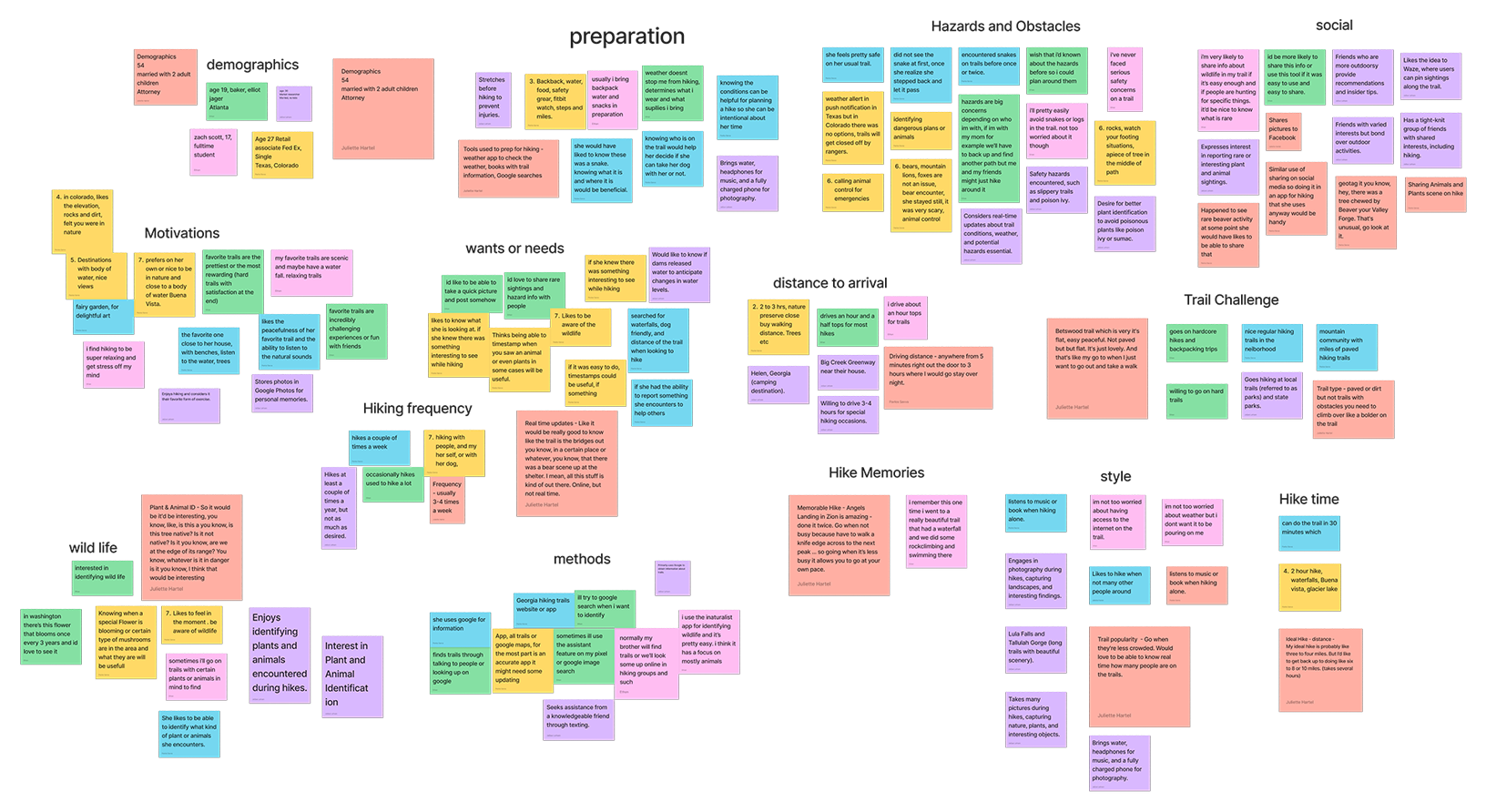
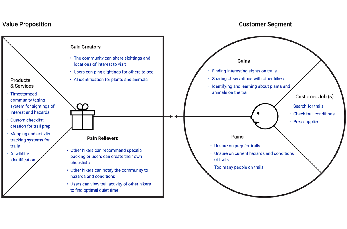
My role: Originated the concept and secured buy-in from the project team and instructional staff; designed the branding, UI, and prototypes. Collaborated with the team on the User Research such as interviews and competitive analysis, the Value Proposition Canvas, the empathy map, Affinity diagram, the User Journey, the Wireframe schetches, and the Problem Statements.
Tools used: Figma, FigJam, Trello, Google Drive
Tools used: Figma, FigJam, Photoshop, Illustrator, G-Suite, Visual Studio, GitHub, Trello, Zoom
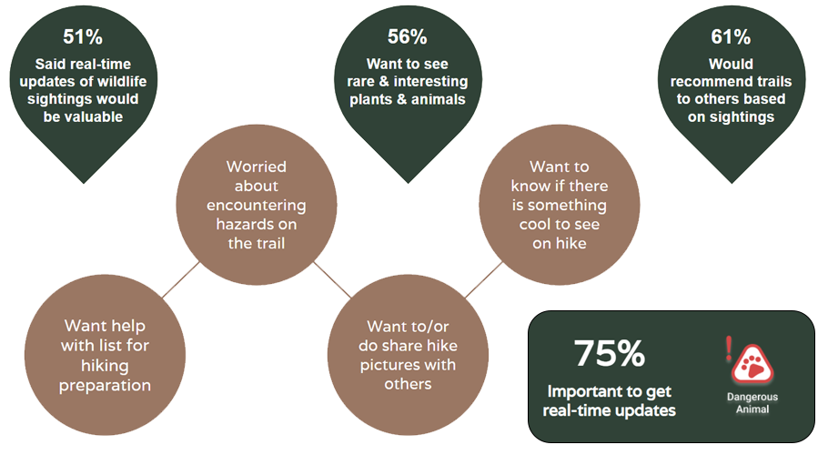
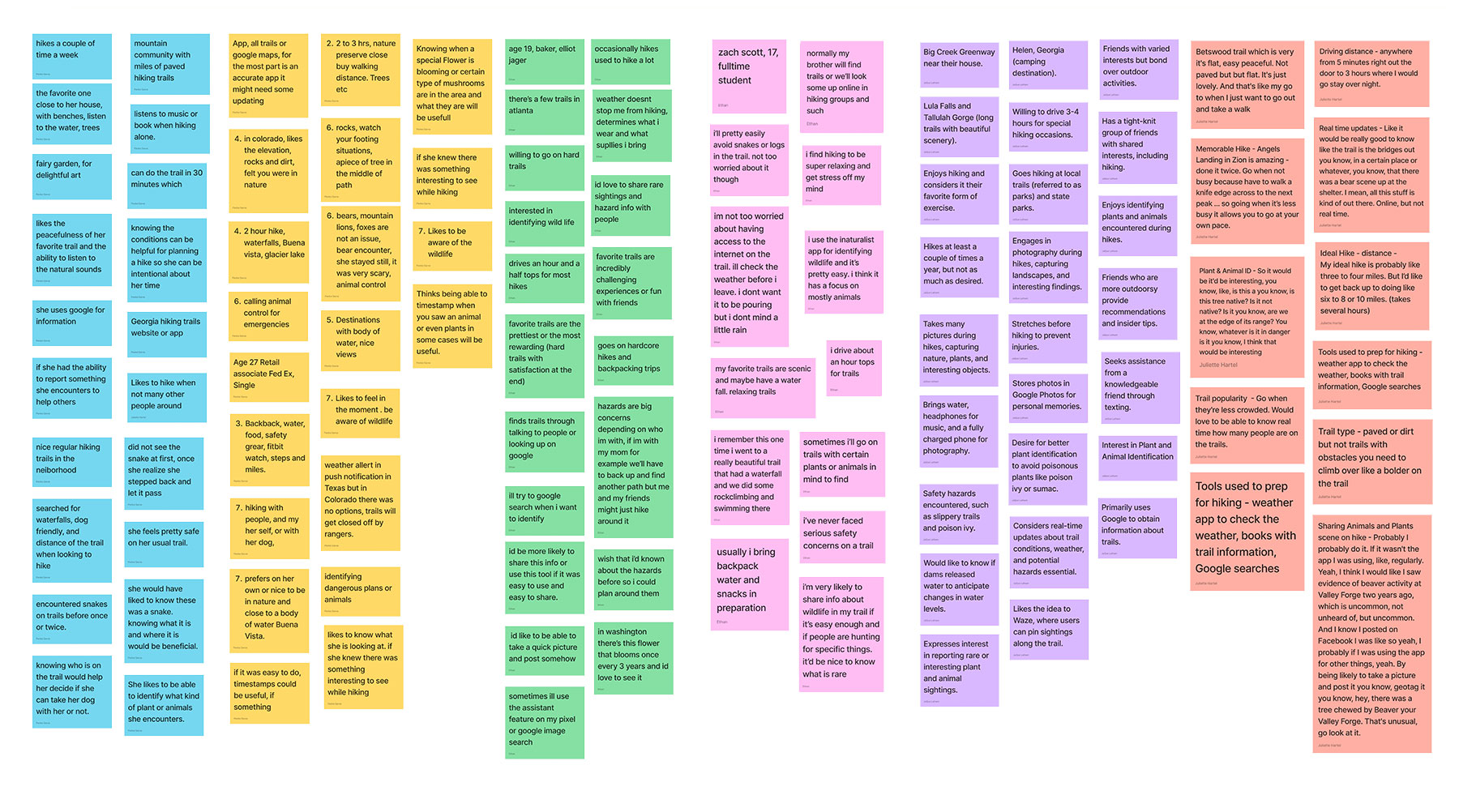
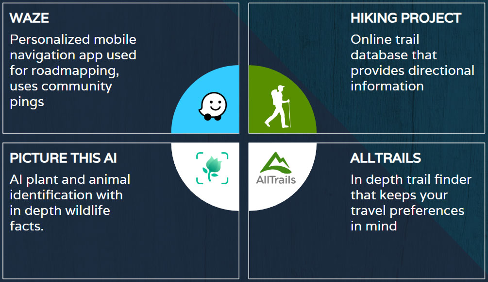
As a team we developed a user interview plan and an online survey in order to to get enough qualitative and quantitative data to validate our problem hypothesis. We performed 6 interviews, and I had the opportunity to conduct 2 of them. 34 people took our survey as well. The insights we got where confirming our hypothesis, that hikers like to have real time updates about sightings on the trail and have the desire to learn more about the wildlife they encounter
The Insights from this research helped us define our user, the actual problem, and also the value proposition for our app.
We discovered that people go hiking as a way to unwind at the end of their day, but they also want to know about dangerous hiking conditions on the trail.
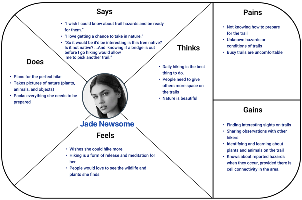
Problem Statement: Jade Newsome, needs access to time conscious updates on trail conditions so she can plan more effectively, and ways to learn more about plants and animals she encounters on the trail.
Value Proposition: Our App Trail Buddy, provides hikers with the ability to notify other about dangers or interesting plants and animals they encounter while on the trail. This is also leveraged by AI which provides an easy plant and animal identification information quickly and easily.
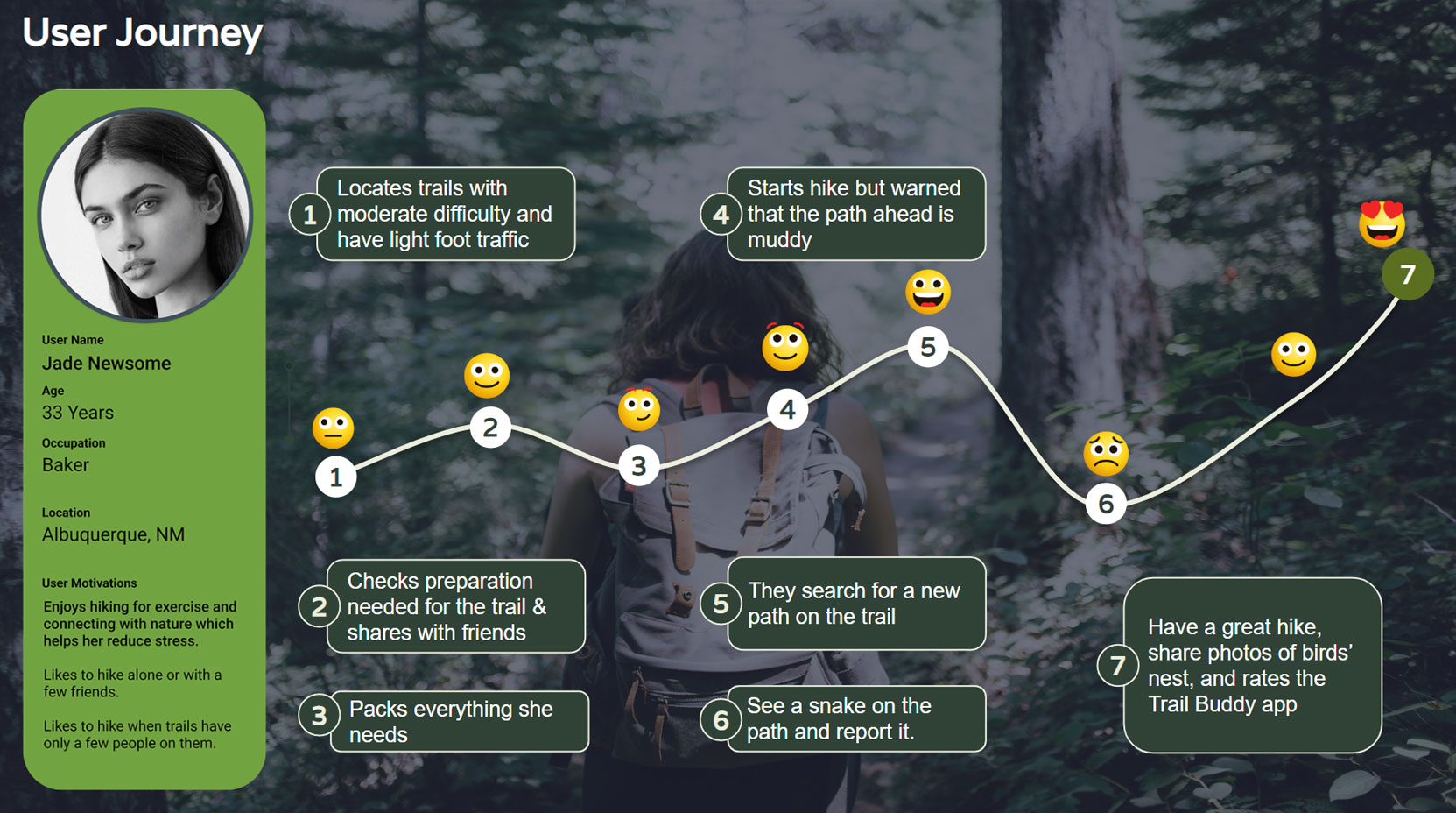
Jade and her friend are hiking together during the weekend. She uses TrailBuddy to look through her favorites list for a trail that has light foot traffic on the weekend. She picks one, prepares her list of hiking essentials for that trail, and shares it with her friends.
Jade and her friends start hiking and TrailBuddy alerts them that the trail ahead is muddy. Jade and her friends pick a new path to avoid the mud. Later on, they encounter a snake on the trail and report it using the Ping feature. They also use the Snap ID feature to share photos of a bird’s nest with the community. They have a great time hiking, rate the trail, and give the new version of TrailBuddy 5 stars.
Our opportunities focus on creating a way for hikers to plan for their hikes, share sightings and identify wildlife while on the trail.
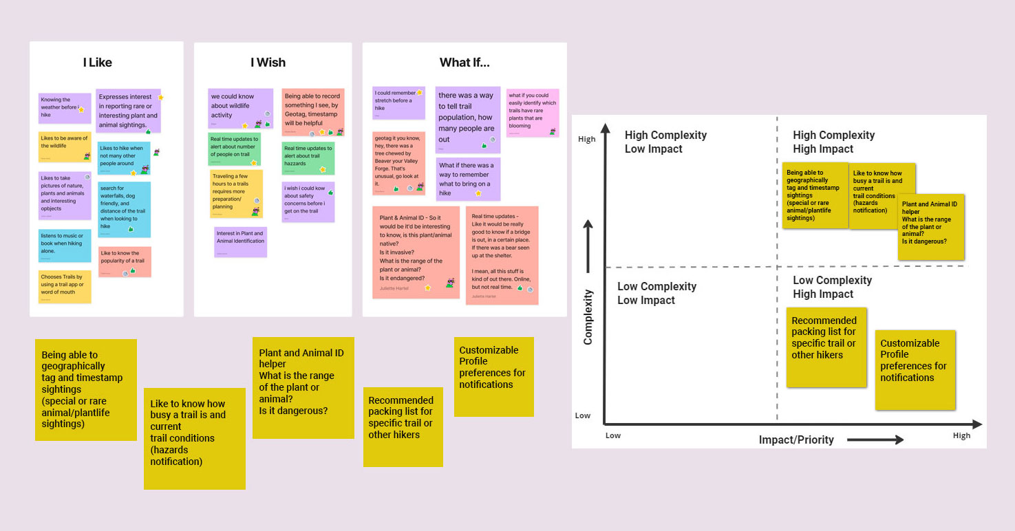
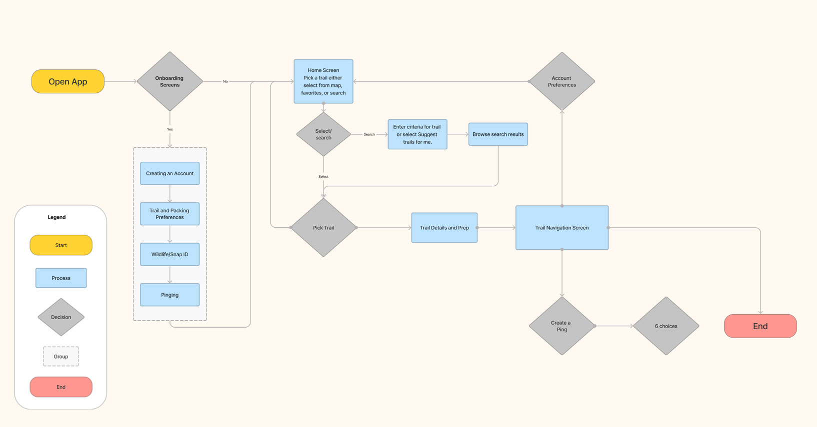
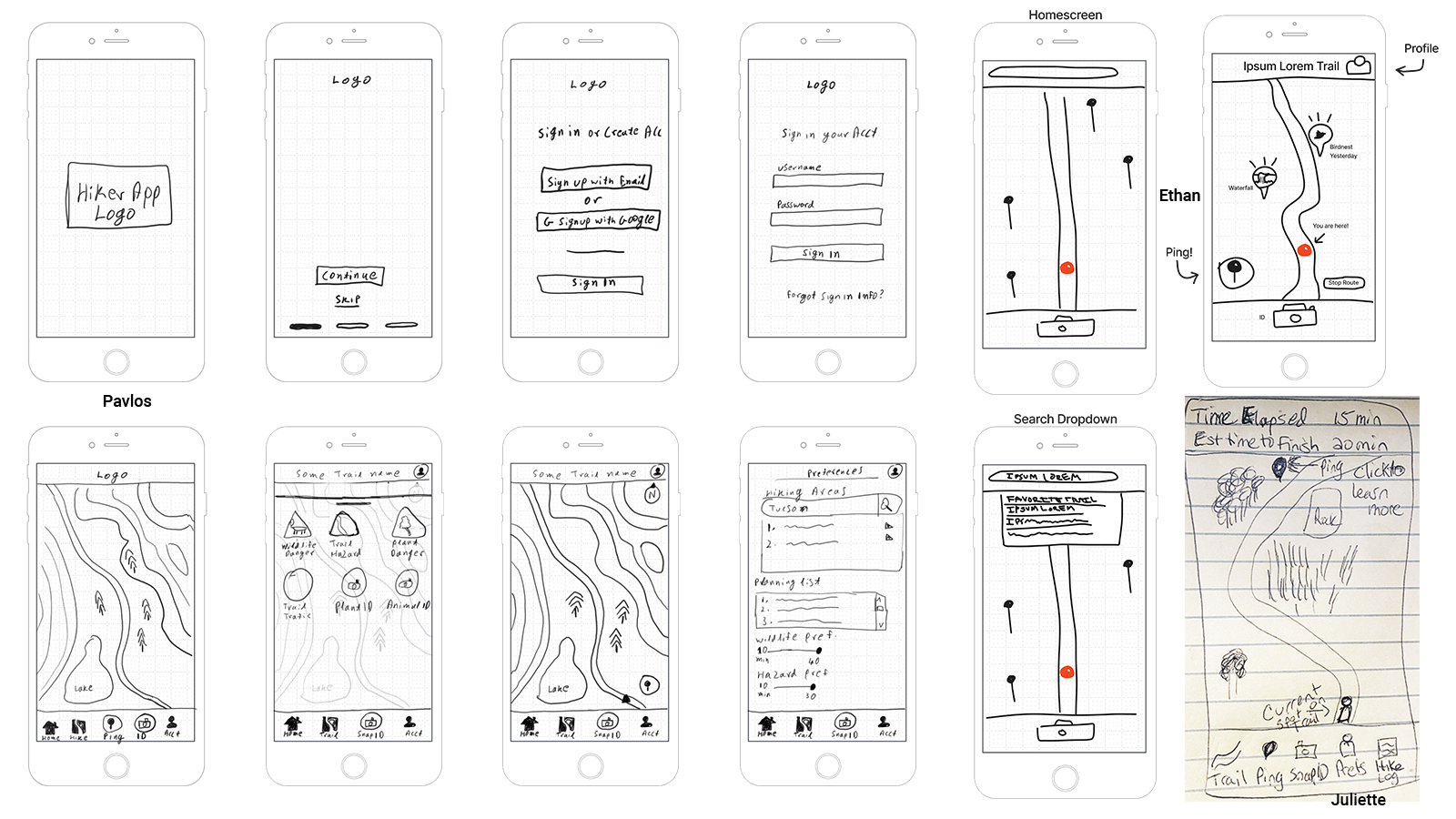
During our brainstorming phase Ethan, Juliette, and I put our ideas together through sketches and discussed ideas to decide on the feel of the user flow.
The taskbar, the overlay for sighting pings, how to begin on a trail, taking a picture to identify the wildlife, and setting the user preferences came together and set the stage for our prototype.
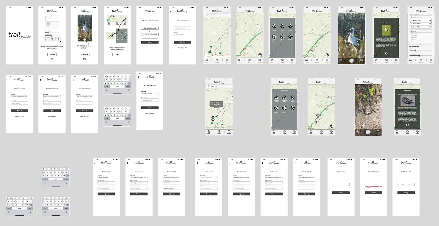
I created the first prototype using Figma. The wireframes can be seen in the image to the left.
This allowed us to test with users to validate our work and identify areas that need improvement. Getting a feel for the overall user sentiment when they use the app for the first time is always insightful.
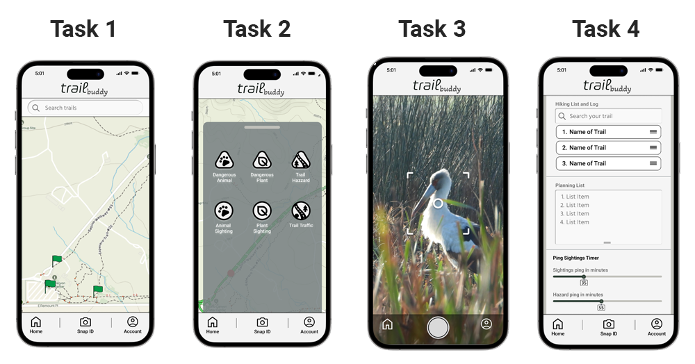
We performed Guerilla usability testing with 3 users and I performed 1 of those tests.
Task 1:Picking a trail from the Home page.
User's needed a little help selecting one of the flags.
Task 2:Placing a ping on the trail.
This was fairly easy for most users, but did not immediately understand the difference between the danger icons and the regular sightings icons.
Task 3:Using the Snap ID feature to Identify plants and animals
There was no particular hesitation with this feature and it seemed to be easy for users to understand.
Task 4:Setting the account preferences.
The users were not clear on some of the language in this section as it relates to the range of time that trail activity is visible.
This project was exciting and challenging; Trying to figure out how to design a new app with a very unique set of features that is set apart from the competition was inspiring. We faced challenges but we managed to push through as a team and accomplish our goals within the time constraints of this project. We are looking forward to pursuing this app further in the near future. We all grew during this project and the results make me proud of our efforts.